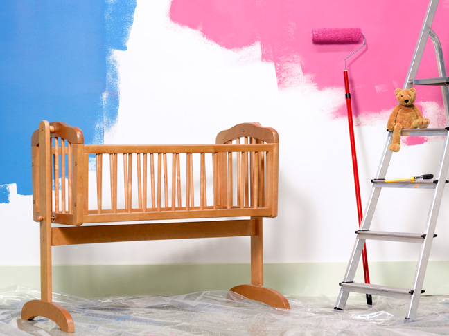
The world’s #1 authority on color, Pantone, has broken from tradition this year by announcing not one, but two Colors of the Year for 2016: Rose Quartz and Serenity. That’s light pink and baby blue in everyone else speak.
The colors are described as “weightless and airy” by Pantone color experts. “Like the expanse of the blue sky above us, Serenity comforts with a calming effect, bringing feelings of respite and relaxation even in turbulent times,” according to a release. “Rose Quartz is a persuasive yet gentle tone that conveys compassion and a sense of composure.”
So, what do these calming, compassionate colors mean? It’s all about their “unilateral approach to color coinciding with societal movements toward gender equality and fluidity,” according to the release. Gender equality — we like that!
By contrast, the 2015 color of the year was a deep, rich Marsala.
Pantone is known for setting trends in fashion, beauty, home decor world, and beyond. Major companies like Kitchen-Aid and Sephora have already announced plans to incorporate Pantone’s 2016 colors into their product line, so get ready to see a lot of pastels next spring.
More Fun Color Ideas:
- 5 Creative Ways to Add Color to Your Home
- How to Pick the Best Lip Color for Your Skin
- Decorating: Picking Out The Perfect Paint Color
Photo: Getty


